Behind the scenes: colour and materials


Which colours and materials will define the trends in design for the coming years? This seemingly impossible question is one of the focal points of the work of any trendsetter. In the same way that Materia scouts the world for materials innovation, our friends at Global Color do the same for colours.
So how do you answer a tricky question like this? Ten experts were gathered from around the world, from paint specialists to wearable-textile professionals. Materia was present at the session, and the results were as interesting as they were impressive.
Trends are gathered from global media (think images from the various wars, economic and political strife around the world), design highlights like the latest smartphones and cars, and newly introduced materials that have a huge influence on the way our designed and built environment are made. Consider carbon-fibre, which was only available in its characteristic anthracite colour when first on the market. We still think of carbon-fibre as being dark grey, even though it is now available in various colours.
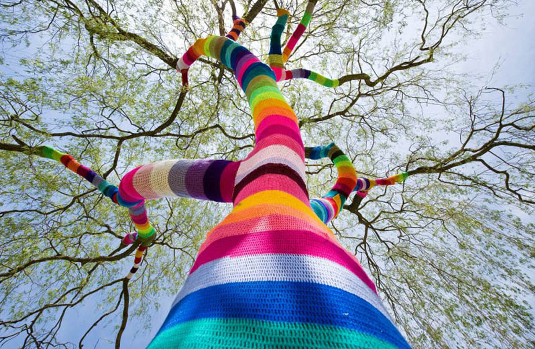
Four main themes evolved from the discussions: Fuse, On, Remote and Totem. Each of these words encompasses the ideas collected by the experts. Fuse, for instance, incorporates ideas on synaesthesia (connecting colours with sensory input), which came from yarn bombing, a recent knitting trend which is far sweeter than it sounds.
We’ve connected some materials to the themes. In the Fuse storyline, BOLHAS fits in, as it is literally fused with colour: bright pigments mixed with high-quality Brazilian glass. Also, Recemat is an organic looking metal. Its cellular structure looks like bone, and its soft, lightweight feel transport the panels to another dimension.
Meanwhile, the Remote theme collected ideas on distance, homeliness and dreams. So we found Decorex, a metal that folds and stretches, for close-up use as well as distant buildings. It’s available in a range of dreamy colours and shapes. Another highlight is the Akzent. It’s beautifully carved MDF coated in hazy, floating tints and hues to give the panels a range of effects.
This kind of session is a very informative look at the way expert opinion, experience and feeling come in to play when the design world looks towards the future of colours and materials.
Have a material that you feel should be on this list? Let us know via info@materialdistrict.com.
Comments
You must be logged in to post a comment.

Very interesting. It will be very nice to have more information on the trends and how did you get to that conclusion, especially in colors where I found it a little subjective.