How to design a floor
Most people know that black isn’t a real colour, even if it is the favourite ‘colour’ for many designers. What is less well-known is that there isn’t a standard colour white, either. This is due to varying daylight around the world. In northern countries, light is cool and white takes a crisp hue. The further south you go, the warmer the light gets, and the softer white will look.
This is one of many factors that come into consideration when designers work internationally. Tamar Gaylord makes flooring collections all over the world for Forbo. In this article she shares her knowledge of flooring with us, and takes a look at several important factors in floor design.
In general, neutral colours are the most popular. That means it is of high importance to find the best ones. For her collections, Tamar finds for the neutrals – grey, brown, and so on – which allow for some flexibility. A carefully selection of neutrals can then be used in a wide range of interiors.
Even within Europe, light varies dramatically. Scandinavia has cool light, while in Italy the light is warmer. So the same colour grey will appear differently in daylight.
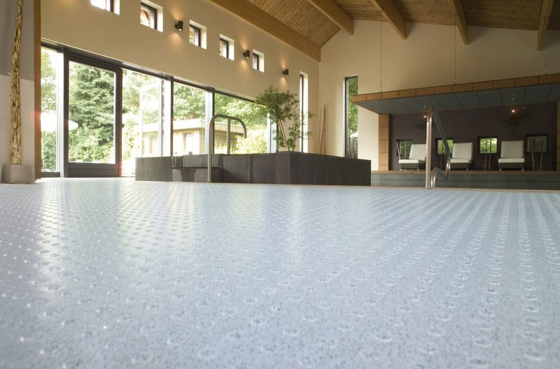
Flooring is the basis for any interior, and must combine with any number of products. The trick is to find a neutral colour such as taupe, a warm grey, that doesn’t dominate the space it’s in too much. It should sit ‘quietly’ and be in support of furniture and other objects.
This means the context is also important. Most natural materials come in a richness of shades, which make them an easy companion to many materials. If a neutral colour draws too much attention to itself, it can need alteration.
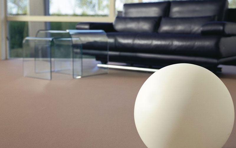
Besides this aspect, the character of a material comes into play when deciding on its colour. A paint chip transposed into a material does not necessarily suit that material. Linoleum, for instance, has a basic ochre hue, a result of its ingredients: linseed oil, tree resin and wood flour. Printed vinyl, on the other hand tends to have a blue look, and a milky quality in the protective top layer which affects the depth and richness of possible colours – even black.
Increasingly, the term ‘timeless’ is used to describe design, whether it is architecture, interiors or even a flooring material. Current markets demand subtle neutrals with only a hint of colour to them. These hues need to last at least 20 years.
Over the years, there has been a global shift towards cool greys, and recently the focus has been on warmer, green-grey colours. In particular, natural greys, such as limestone or slate, have a very solid feel and are popular. At the other end of the spectrum, airy and light colours are used, with whites as clean and crisp as can be.
This article appeared in an edited version here.
Images via Forbo and creative commons.

Comments